Psychology of Typography and Font Pairings That Work
Ever wondered why certain words seem more trustworthy or appealing than others?
Enter the world of fonts—a subtle yet powerful influence on how we perceive information. Fonts aren’t just styles of letters; they’re psychological triggers that shape our emotions and reactions.
There are over half a million fonts worldwide, but we are used to the same handful.
Calibri,
Times New Roman,
Helvetica,
You know the drill! And while these fonts are reliable for professional documents, letters, and resumes, there are times when a touch of novelty can make a difference. Choosing a font or a pairing can seem daunting with the variety and style, but we are here to help you best understand how to select a duo to suit your brand.
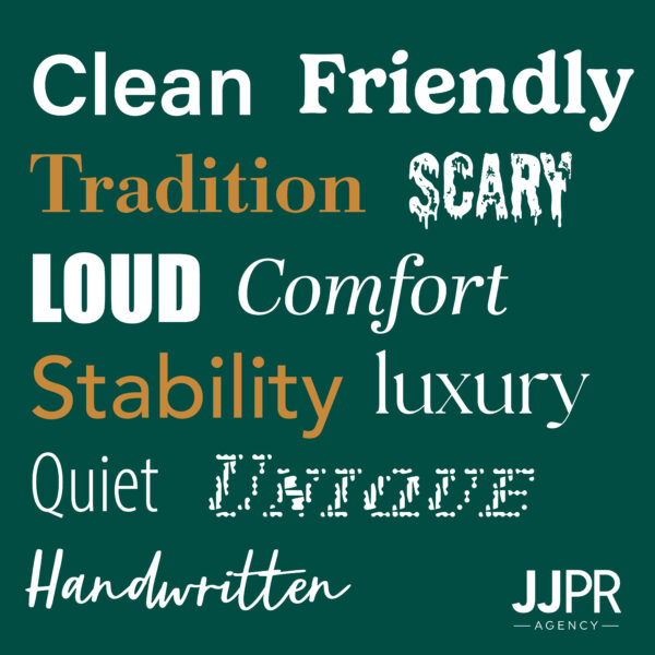
Typography VS Fonts
Both of these words are often used interchangeably, actually but have different meanings!
Typography is the art of arranging and designing fonts to make text visually appealing to readers. This can also refer to the meticulous arrangement of fonts, as well as the sizing, spacing, etc that determine visual appeal.
While fonts refer to the set of printable or displayable typography or text characters in a specific style and size.
Psychology of Fonts
Fonts play a significant role in shaping our perceptions and emotions, often operating subtly yet powerfully in various aspects of daily life.
In essence, fonts are not just tools for visual communication but powerful instruments that influence how we interpret and respond to written information. Understanding the psychology of fonts enables designers, marketers and communicators to make intentional choices that effectively convey messages and resonate with their audiences.
Beyond aesthetics, fonts affect readability and message delivery. The spacing between letters and the thickness of strokes can alter the mood of a text—subtly nudging us toward trust, creativity or urgency.
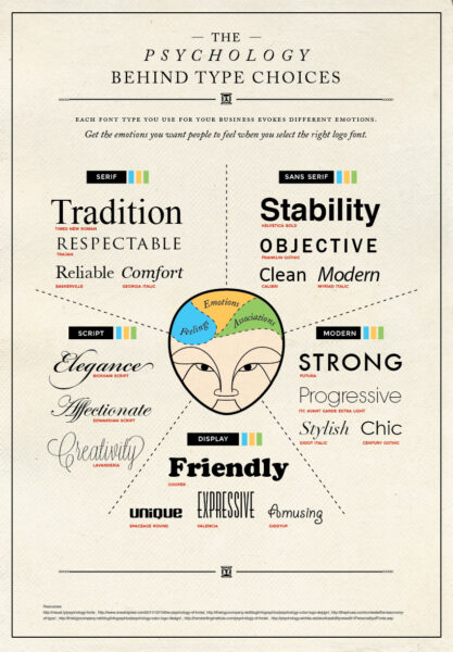
Check out some of our favorite examples of successful font usage below!
New York Times: This distinct font wins a spot on our list for favorite font usage. Through their easy-to-distinguish branding, to the contrast of spacing in the logo- this timeless font is one of our favorites.
Avatar: https://www.youtube.com/watch?v=jVhlJNJopOQ We’ll leave this here.

Coca-Cola: Coca-Cola has been around for decades, and their font choice exhibits just that. The timelessness of the logo shows us that this brand is established and is here for a long time. By choosing the Spencerian Script—a style of cursive popular in the early 1900s—Coca-Cola has selected a font that not only pays homage to its heritage but also ensures its brand will remain classic and recognizable for generations.
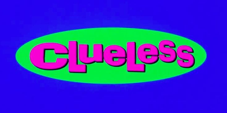
Clueless: This iconic 90’s romcom is an excellent example of contrast in a logo. By utilizing the Ad Lib font, the logo features a dynamic interplay of small and large letters in varying heights, enhancing visual interest. The striking pink logo is paired with vibrant green accents, creating a bold contrast that draws the eye directly to the lettering.
Tips and Tricks
We have compiled a skillful list of tips and tricks on how to amplify your font usage and pairings. Whether you need some suggestions, or just our information on typography, keep reading below for some of our tips!
- Readability Is Your Top Priority: If it’s not readable, then your entire message won’t be conveyed. Search for a good blend of typography that expresses your brand’s personality while making sure that it is clean and concise.
- Study Successful Font Pairings: Learn from the pros! Take note of a successful company’s design choices and use their triumphs to refine your typography.
- There’s a Time and a Place: So maybe using Comic Sans on your professional resume isn’t the best idea. But adding it to a children’s birthday invitation is perfect! Keep your target audience in mind when selecting fonts to ensure that they are received well by the viewer.
- Aim For Contrast and Harmony: Big and small. Thin and thick. Dark and light. Using contrasting font pairings will draw the viewer’s eyes to your wording. By utilizing contrast, it can also show the audience what the most important piece of information is on the page. By using a big, thick and dark font as your header, this allows the reader to prioritize that piece of information first. So yes … contrast is important, but too much contrast can make your font pairings too starkly different. Making sure that your pairings have a good blend of contrast and harmony is a great way to blend your two fonts.
- Stay True To Your Brand: Not every logo, brand kit or font combo will be the same. Find ones that represent your brand and mission.
So next time you scroll a website or read a book, pay attention to the font. It’s not just a typeface; it’s a silent communicator that influences how we perceive and interact with words. Discover the art and science of typography—and uncover how fonts shape the stories we read every day!


