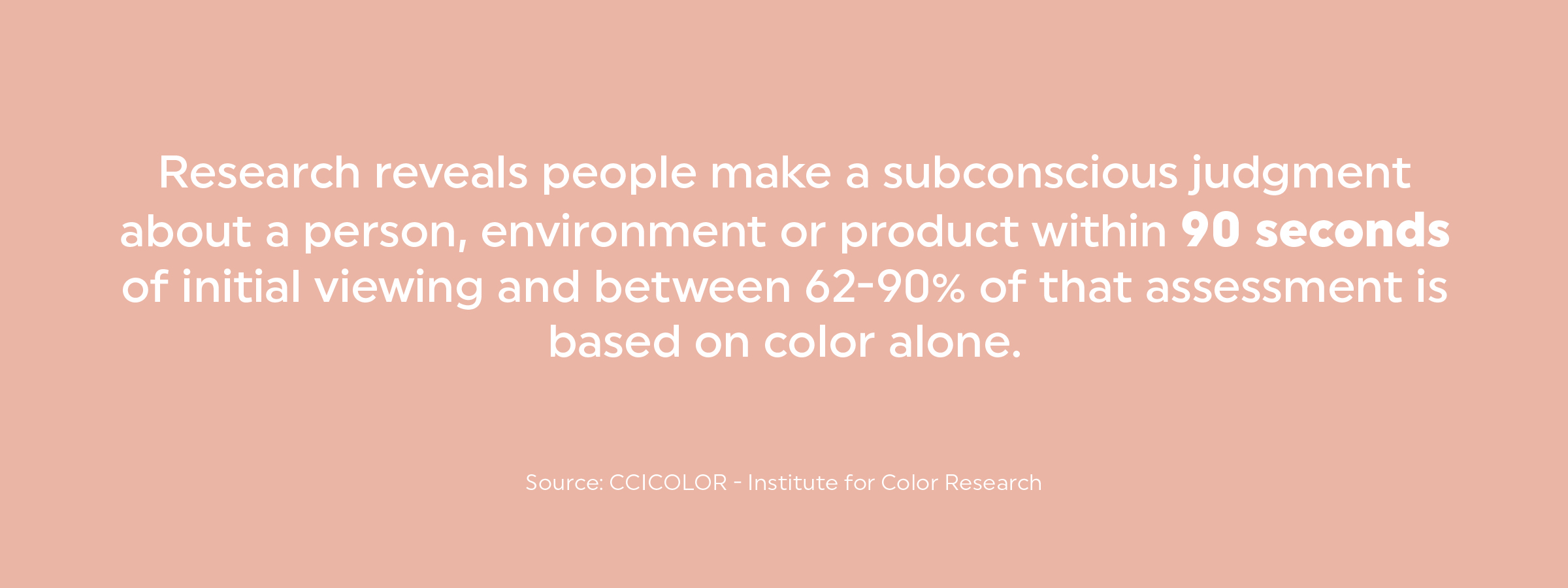
Ninety percent of product snap judgments are based on color alone. For real. Or as the young kids say “for real for real.”
Think about it. When creating a brand for an existing business or startup, the colors you choose for your brand affect how others perceive your business.
Take a look at fast food restaurants. What is the color you see the most? Chick Fil A, McDonald’s, Freddy’s, KFC, Popeyes, Burger King, Wendy’s, Pizza Hut – what are the most common colors? Red or yellow. The color red makes us feel energized, passionate, and most importantly, hungry. Like, right now. These restaurants want you in and out quickly but also want to make you impatient for their food. Aware of it or not, colors help a consumer decide whether or not they want to engage.
For other brands, red would not be the best option for brand color. For example, how does red make you feel when thinking about a hospital or health care? Probably anxious and a little bit queasy. So, health care organizations and hospitals tend to lean toward blues and greens for their brand color palettes. Blues and greens invoke feelings of peace, security and health.
Of all the colors in the rainbow, how do you choose the one that is right for your brand?
Here are a few ways to decide what color palette is best for your business.
What is your competitor doing with their brand?
- Are they marketing their brand with bright colors or lighter colors? You want to be able to stand out among your competitors.
- What separates you from your competitor? If it is your thoughtfully-sourced ingredients, then maybe use green to represent sustainability. If it is your customer support, then use blue to represent trustworthiness.
What colors are in your product?
- If you have a product or service, are there any colors used more commonly than others? For example, if your business designs, installs and maintains swimming pools. Most swimming pool businesses choose blues and shades of green to reflect the water and the clear tranquility of what a pool represents. Brown or yellow in the brand colors could be perceived as something wrong with the pool.
What is your brand essence?
- Your brand essence is the foundation that defines what your brand stands for and the thoughts, feelings and emotions you want to evoke in your customers including your:
- Brand goals
- Target audience alignment
- Brand personality
What is the aesthetic you are trying to convey?
Are you a fast-food restaurant that wants to illustrate to customers efficiency and speed of service? Or are you a spa wanting to promote a safe, tranquil environment? Or maybe a construction firm wanting to convey to customers confidence, trust and reliability in your services? These adjectives can help determine which brand colors you should use.
- Steve Jobs chose white for the Apple logo for two reasons. With his passion for design, Jobs knew white is the color of purity and aligned with his vision of beautifully-designed products.
- McDonalds chose their colors because red is stimulating, increases the heart rate, and as a result, fuels your appetite. Yellow is associated with happiness, and is the most visible color to spot from a distance.
What are the basic steps for choosing your brand palette?
Color theory has been around for more than four centuries. Established by Isaac Newton around 1660, he theorized that colors are grouped into three categories: primary, secondary and tertiary. Designers use color theory as their basis to carefully select colors that will create balanced and effective combinations.

Begin with one to three primary colors for the main brand, these will be the colors that are most recognizable and will determine the first impression of your brand. Next, choose complementary colors to blend with your primary colors, these choices make up your secondary colors creating accents and providing versatility to the brand. Not all brands require secondary colors, but it never hurts to have one or two. When in doubt, keep it simple so you don’t confuse your audience.
Color Codes
Back in Isaac Newton’s day there were very few options to view or create colors. Now, the colors you choose for your brand will be viewed in several different mediums. In print, digital, television, smart phones, tablets, etc. All of these mediums have varying sources of light that can change the makeup of your color. So, to keep your color consistent across these mediums designers must create the appropriate color profiles for each.
There are several different color profiles, RGB, HEX, CMYK or PMS. The color profile you use depends on the environment. RGB and HEX colors are primarily used in website and online applications. Printed materials always use a PMS profile or CMYK mix. All of these profiles create a different mix suited to the medium they are being viewed in.
No matter where your brand is going to be seen the most, it is beneficial to have all the color variations in your brand standards to keep your brand colors consistent across all platforms.
Consistency is key.
Summary
- Identify colors that match with your brand values.
- Use color theory to determine primary and secondary colors.
- Create color profiles for consistency across multiple mediums.
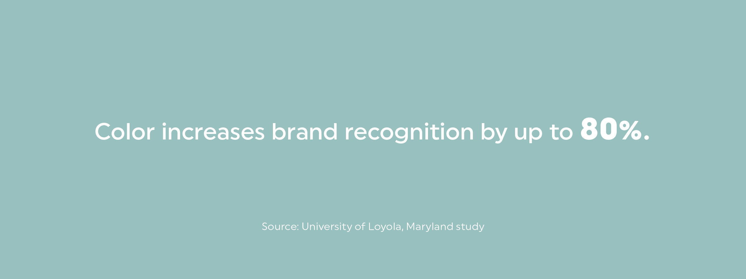
Using the psychology of color to build the perfect color palette for your brand is a great way to enhance and create a consistent visual identity and build brand recognition that engages your audience.


